I am looking for a place which can take care of Sydney (my cat) when i travel today and a couple of names pop up after some Googling.
I don’t know where most of those places are so naturally i need to use some kind of street directory for Singapore.
For those who are not living in Singapore, there are a couple of popular street directories over here:
- Singapore Land Authority Map: www.map.gov.sg/StreetMap/
- Streetdirectory.com
- Map provided by Rednano: unfortunately it doesn’t work with firefox so why bothers
- StreetDB: This one seems new to me but it seems alright, not too bad
- Google Map: ya don’t forget Google map as well.
Anyway, when i first came to Singapore, i used to use Streetdirectory.com because they can provide information based on postal code, MRT and Bus guide as well so it was pretty convenient.
By now you may wonder why on earth i talk about streetdirectory on my blog???
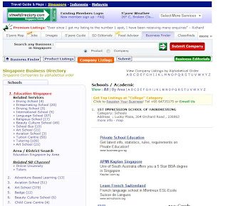
Well the reason is to me streetdirectory.com is a prime example of a site with extremely messy interface.
With such a packed home page, to me it’s truly amazing! By looking at the different tabs, we can easily see that streetdirectory is trying to become a portal with: jobs, images, singapore guides, food advisor etc…
As a professional habit, i try to find out more analytics data about this site and see whether other people get confused like me when they come to this site.
Below are the few data that i can gather using free tools:
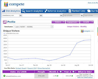
The above is streetdirectory.com’s unique visitors for the past 1 year. It seems that they are doing rather well in getting more visitors to their site. Or at least that’s what it seems to be.
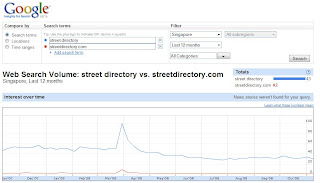
How about some numbers from Google
From both Google Ad planner and Compete, it looks like streetdirectory has about 330k+ unique visitors from Singapore, which is not bad at all.
I did anothe quick search on Google Insights for Search to see the trend and just to be sure:
However, what i want to understand is more about user engagement metrics since it reflects the quality of the user interface (the design).
Some of the more popular user engagement metrics include:
- Time spent on site: Average stay/visit
- Pageview/visit
- Visit per person
- Most popular content vs Site main function
- etc…
- (There are so much to talk about user engagement and it probably takes up a whole new article)
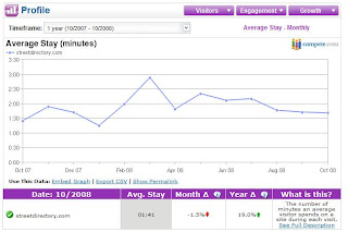
(Average Stay per month: the trend is going down)
Again we can see a downward trend here. However, i need let you know what i used to do when i visited streetdirectory a couple of years back:
- Type in the postal code/street name/land mark
- Choose the exact location from the search result page
- Choose the mode of transport i want: Drive/MRT/Bus
- See how i can get there and so on
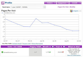
Well as you can see, for an user like me my pages per visit should be around 3-4 pages so when i see that the average pages per visit for streetdirectory right now is hovering around 1.6, i think that means they have a lot of bounced visits.
People just land on the site and decide that it’s so confusing and leave.
Next i browsed around and visitd one of the hot section Food section, i chose “Asian Restaurant”
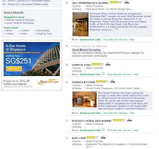
Do you notice those Google Adsense at number 2 position?? This is supposed to be the place which lists down all the popular restaurant in Singapore that have Asia Food….
Why Google ads are at number 2 position? are they trying to let people think that those ads are actually Editor choices so that people will click more and help Streetdirectory earns more money from Google?
By the way, that’s everything above the fold.
How about below the fold:
We start to see actual listings at position number 3 all the way until number 10.
And then at number 11, Google Ads again.
So that’s Food section, how about Business Finder section?
Same thing again, first position is a genuine listing and second position is Google Ads…
In short, i think that we can’t conclude anything firmly without more analytics data, specific user engagement data. (Unfortunately from those free tools which are available for everyone, there is a limit to what i can gather) Yet, my personal view about this is that it’s a bad site in terms of design, too complicated and confusing. They choose to monetize this site from a very obscure and short term way, which is displaying as much advertisement as possible and do not care about user’s experience at all.
Well, we see how they go, but one thing is clear, i try not use streetdirectory at all unless i seriously have to and i’ve managed quite well this year 🙂

