Please do NOT prepare 100-slide monthly report
Stop drowning stakeholders in 100-slide reports they won't read. I'll show you how to craft concise, actionable reports that actually get attention and drive decisions.
I have a confession. Early in my career, I was the person who wrote the 100-slide report. I remember spending an entire weekend pulling data from every platform, building elaborate pivot tables, and animating Powerpoint transitions like my life depended on it. I was so proud of the result. Sent it out to the client on Monday morning. Waited for the praise.
Nothing. No reply. Not even a "received, thanks."
A week later, during a status call, the client casually asked, "So how's the campaign going?" It hit me — they never read the report. All those hours, all that effort, gone. That experience changed how I think about reporting forever.
I use mainly digital marketing campaign reports as examples in this post, but the principles hold true for any type of reporting.
Why are we even writing reports?
This sounds like a stupid question, but when you dig deep enough, you realise that different people involved in a project have very different reporting needs. Top management cares about the big picture — overall objectives, achievement against KPIs, how marketing data relates to sales and brand awareness. A marketing executive managing a specific activity cares about execution details and performance comparisons.
I think the first step — before writing a single slide — is to get on the same page with your stakeholders about what the report is actually for. Is it to track progress? Fulfil a contractual requirement? Provide actionable insights for the next phase? The answer shapes everything.
Put yourself in the reader's shoes
Here is the uncomfortable truth: reading your monthly report is probably not the highlight of anyone's day. Think about it — how much time does your audience realistically spend on it? Two minutes? Five? They are busy with their own to-do list, their own fires to put out.
If the normal reading speed is about 2-3 slides per minute, and your audience is likely spending about 10 minutes with your report (being generous), that gives you roughly 20-30 slides to work with. So what are you doing with 100?
The general rule I follow: if you send a report out and there is no feedback about it, there is a very high chance the recipient did not even read it. I have been on both sides of this, so I am not judging — I am just sharing what I have observed.
What a good monthly report looks like
In my experience, a good monthly report should not exceed 20-30 slides. Ideally, keep it under 10 if you can. The must-haves:
- Top-line results related to the objective
- Are we on track? Based on the current rate, will we hit the overall KPIs?
- What happened last month? What worked, what didn't, and most importantly — why?
- How do results compare to previous months, last year, or competitors? Again — why?
- Recommendations and next steps — the part your audience actually needs
I used to think that including everything showed thoroughness. It does not. It shows that you have not done the hard work of figuring out what matters. And I say this as someone who learned it the hard way :P
End campaign reports: even simpler
For end campaign reports, keep it tight:
- Campaign objectives — a quick reminder so that someone brand new could follow along
- Campaign KPIs
- Did we hit them? Go straight to the point. Yes or no.
- Analysis of 4-5 key results — not 20, not 30
- Conclusion and recommendations for the next campaign
Please check your data
Wrong data is worse than no data. At least with no data, you cannot draw the wrong conclusion. With wrong data, you give wrong advice — and people make decisions based on it. Please double-check, triple-check what you put in your report. Make sure you understand the terminologies. I have seen cases where the traffic from one channel reported by an agency was more than the total traffic to the site. That should not happen.
A few common mistakes
Here are some real examples I have come across over the years (anonymised, obviously). I have made some of these mistakes myself, so this is not about pointing fingers — it is about learning together.
- Slide title that doesn't match the content. If the title says one thing and the data shows another, your reader will be confused. And confused readers stop reading.
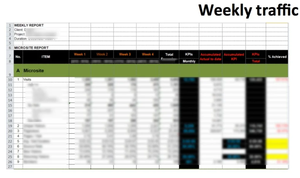
- Copying a massive table from Excel into Powerpoint. A table with 10 rows and 10 columns in a slide is painful to read. Ask yourself: can I delete any rows or columns and still communicate the same message? Can I turn the table into a chart?
-
Too many words, too many tables, no graphs. I am a big fan of simple graphs and pictures that tell a meaningful story. A wall of text on a slide is not a report — it is a punishment.
-
Trying to communicate 3-5 different things on the same slide. Pick one message per slide. If the slide title, the conclusion, and the content do not relate to each other, the slide is broken.
- Overly complicated tables with no context. If you cannot explain why the reader should care about the data, do not include it. A complicated slide that nobody can decipher does not make you look smart — it just wastes everyone's time.
The bottom line
Clients hire agencies to make their lives easier, not harder. And if you are on the client side writing internal reports — the same applies. Your job is to help your audience make better decisions, not to prove how much data you can pull. I learned this the hard way, and I hope sharing it saves you some of the same pain :)
Do you have any reporting horror stories — or tips that have worked well for you? I would love to hear them.
Cheers,
Chandler