I have just put a room on this site. It is a study in a house that does not exist, on a hill above the ocean, and you can walk around it, sit down and pick things up. The house is imagined. Everything you can pick up in it is real: my books, the courses I took, the products I built, the parks I have visited and the recommendations colleagues wrote for me on LinkedIn.
It took four attempts to get here, and the first three failed. I think how they failed is more useful than the room itself, so that is what this post is about.
Why three.js at all
It started on X (Twitter). I kept seeing amazing 3D work there, things people had built to run in the browser with three.js, and I wanted to try it myself. That was really the whole reason. When we wrote down the goal for the first attempt, it was simply that the point is to build something in three.js. I was curious.
Attempt one: ten looks at the same idea
In late September I started with my blog archive as the subject: 523 posts, arranged in space by time and topic. We built six concepts as real renders, a landscape of columns, a two-ink risograph print, a star map, a paper storm, a terrain relief and a tiny desk diorama. Four more ideas (a book, a tree, a press room, ink in water) got as far as rough mocks. Nine of the ten are below. The landscape of columns was never saved.
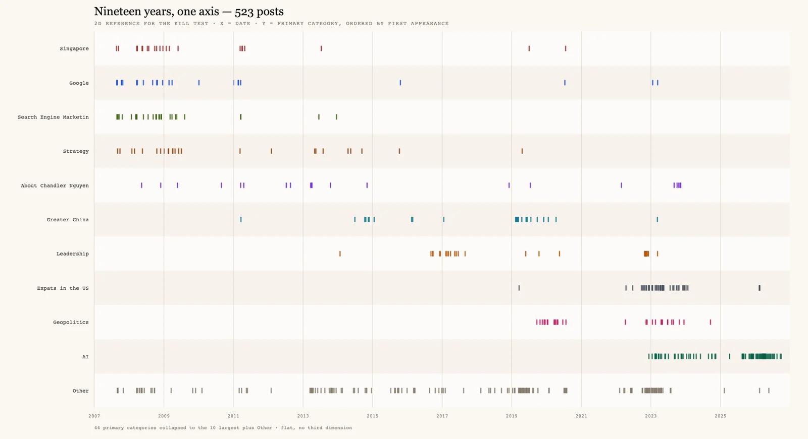
I rejected all ten. When we wrote down why, the conclusion was simple. Every attempt was the same idea, dots made from the same posts, with a different renderer. Changing the technique ten times could not fix the fact that the piece had no real subject. We had also drawn the same data as a plain 2D chart, as the bar the 3D version had to clear, which is a good test I would recommend to anyone tempted by 3D for its own sake.
Attempts two and three: a real subject, and the wrong fight
At the beginning of October I tried again with real subjects: how Ask Sydney finds the sources behind an answer, and how one of my products works inside. The first versions were simple, and they were really made for people like me, who already care how a pipeline works.
So we did a proper art direction pass on both. Models made in Blender, a lit environment, bloom, depth of field, fog and soft shadows. The pieces were tested, accessible and ready to translate. However, I still judged them not good enough, because I was comparing them with the concept art I had generated with an image model before we started, and next to that they lost every time.
Here is each piece in three stages: the first version, the art-directed version, and the concept art I was comparing it with. First, how Ask Sydney finds its sources:
And how DIALØGUE makes an episode:
The lesson we wrote down was that real-time three.js cannot match a photoreal offline render. A still image can spend minutes on one frame, getting the lighting, the depth of field and every texture exactly right. A browser has a few milliseconds per frame. So the rule for the next attempt became: real-time 3D never competes on realism. It wins by responding to the person in front of it, and if a video could replace the piece, the piece is wrong.
Attempt four, and still a lot of no
Those three attempts used different models and tools, including DeepSeek and OpenAI's GPT. None of those attempts reached my quality bar. The fourth attempt, at the beginning of November, was with Claude Opus 5.5 in Claude Code.
I would love to say it worked the first time. It did not. Before the room, I said no to a set of glasses of water showing how a media budget should be split (too tactical), an ink piece, a landscape of cut paper to fly over (too bland), four sketches of other worlds, a walkable museum of my career and a studio with six desks, one for each marketing discipline. My note on the studio was that it was "very far from the wow factor" I was looking for and that "the six desks are terrible". They were.
The idea that worked came from me, not from the model. What if the visitor is a guest in my dream home, and I show them my study? I described the room as I imagine it: the desk with my back against the window, the bookshelf, a long sofa and a table to sit around, drink coffee and talk, a fireplace, and outside, trees and ocean waves, like Big Sur. When I saw the first running version I said "yes this is the direction".
Then came the details. I rejected the puffy sofas, a generic table, an ugly door, a floor lamp and trees that did not look like Big Sur. What I asked for was a "world class, quiet luxury study room". Earlier in the project I had tried to describe the feeling with a good hotel lobby, where the smell and the flowers make you feel safe and looked after, and with a bowl of ramen, which "looks simple but it is very hard to make it right". That is still the best description I have.
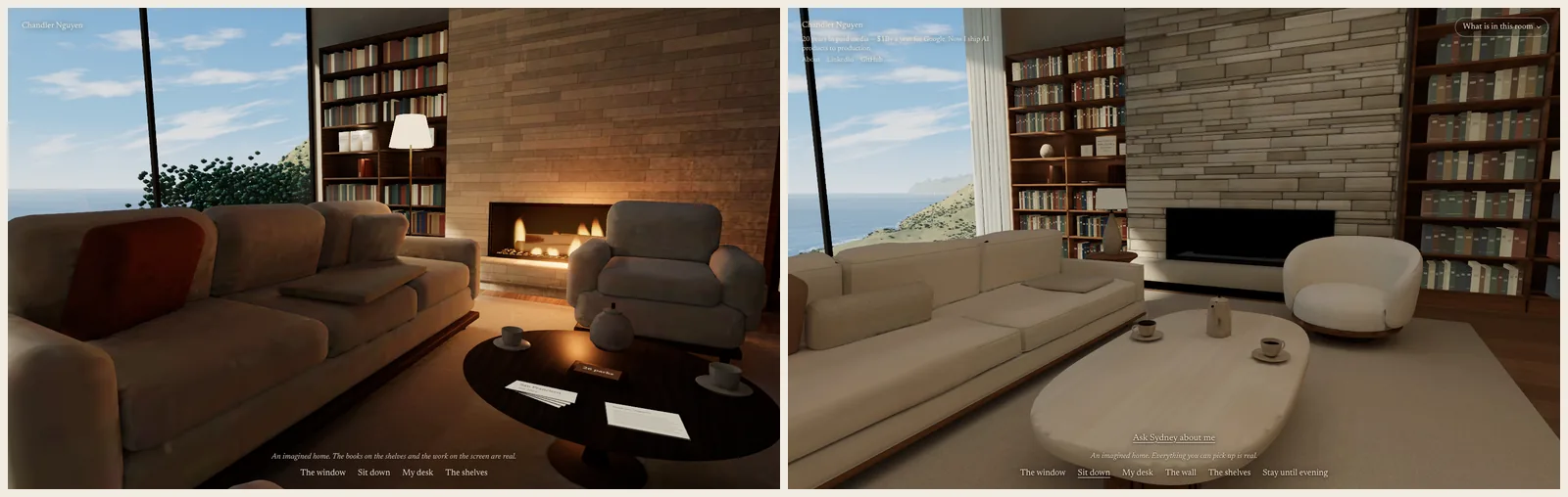
On the left is an early version of the room, and on the right is the room today.
How it is made
Blender builds the room and bakes the light into it, using its Cycles renderer, so the browser does not have to calculate how sunlight falls across the floor. three.js then draws the room live and handles everything that responds to you: walking, sitting, picking things up, staying until evening.
There is one honesty rule. The house is imagined and says so, but everything a guest picks up is real and has a source. The words on each object are short, because my rule for the room was to show it in 3D, with one short line and no wall of text.
The room also works in 13 languages, and it has a written version for screen readers and for anyone whose browser cannot draw it.
The first ten seconds
Before launch we tested the room on a development build, which is slower than the real site, with three stand-in visitors, each given a different role, device and connection speed, and no explanation of the page. They were AI agents, not real people, so I treat this as a smoke test rather than research. Still, the result was clear. The fastest one saw a black screen with "Welcome, please take your time." for about eight seconds. The other two saw black for the full ten. Two of them said they would have left on their own. "Take your time" read as "wait", and nothing said what the page was.
So a still picture of the room now shows from the first second, with my name and one line under it, and the park photos load only after the room is ready. I do not have data from real visitors yet.
After launch I kept going, because a simulated slow phone still took about 8 seconds to go live. The browser now starts downloading the room with the page instead of after its code has loaded, the view of the ocean arrives at half size and sharpens a moment later, and the 3D model itself went from 2.8 MB to 0.81 MB, with no difference I can see. On a simulated slow phone, the room now goes live in about 4.5 seconds. On my own phone it is smooth.
What I learned
Taste matters more than ever. You need to have the taste, and also the vocabulary, to ask the machine to create what you have in mind. Throughout, the ideas and the no's were mine, and AI models did the building. What decided whether it became good was whether I could say what was wrong (puffy, generic, too bland, not Big Sur) and what I wanted instead. When I could not describe it, I got a very well made version of the wrong thing.
A product is a means to an end, not the end itself. You need to understand why you are building it, who it is serving and what conclusions or impressions you want to leave people with. The first attempts started from a technique. The room started from a visitor who has never met me: what they pick up and what they think when they leave. Once that was clear, a lot of decisions made themselves.
Did the model matter? I think it did. This is the first one that got the room past my bar. However, when I read back the notes from all four attempts, the subject and the purpose changed as much as the model did, and I honestly cannot separate the two.
The room is at chandlernguyen.com/study. It works on a phone too, I checked mine. If you have built something in 3D with AI, or tried and given up, what stopped you? I am curious whether it was the tools or the idea.